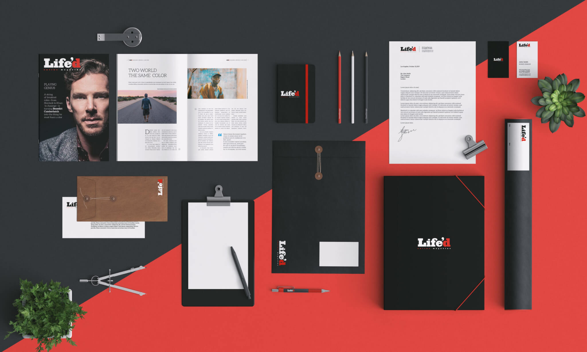
Life’d — A Bold Identity for a Digital Magazine
Online Magazine
An identity that blends journalistic
solidity with modern visual storytelling.
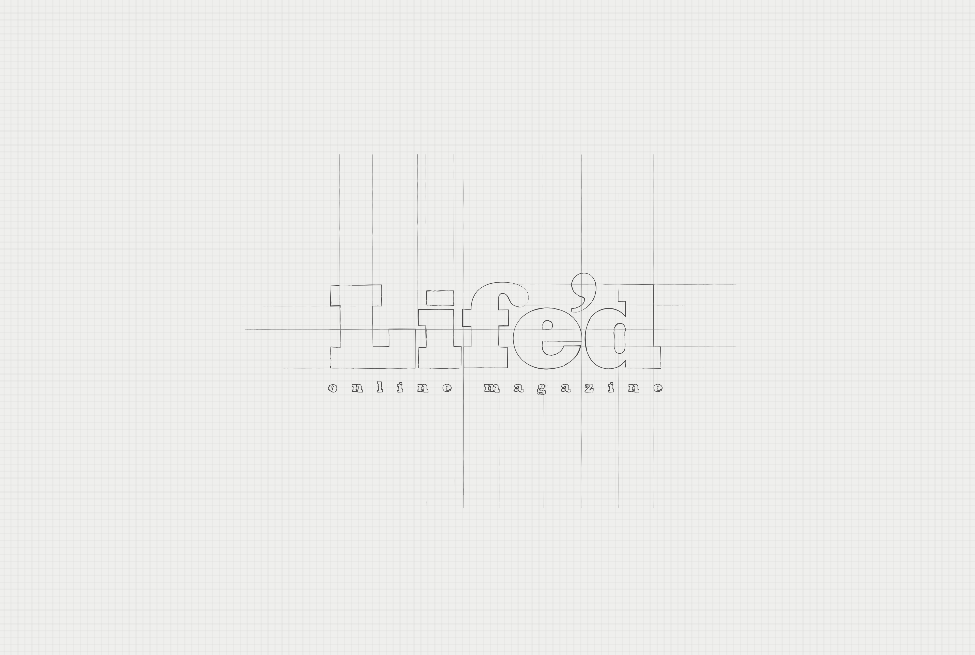
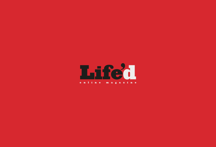
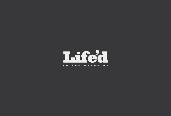
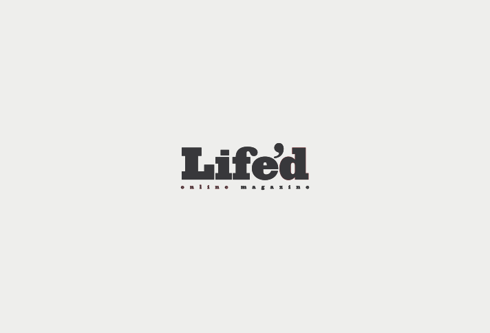
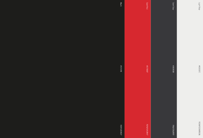
The Life’d logo is built around a strong typographic contrast that immediately communicates clarity, authority, and editorial confidence. The bold black lettering gives the logo a solid, almost journalistic presence, while the red final “D” acts as a visual accent and conceptual pivot.
This color break introduces energy and personality, subtly suggesting dynamism, diversity of content, and a contemporary digital attitude. The apostrophe reinforces the idea of life condensed into stories, fragments, and perspectives — an open-ended narrative rather than a closed definition.
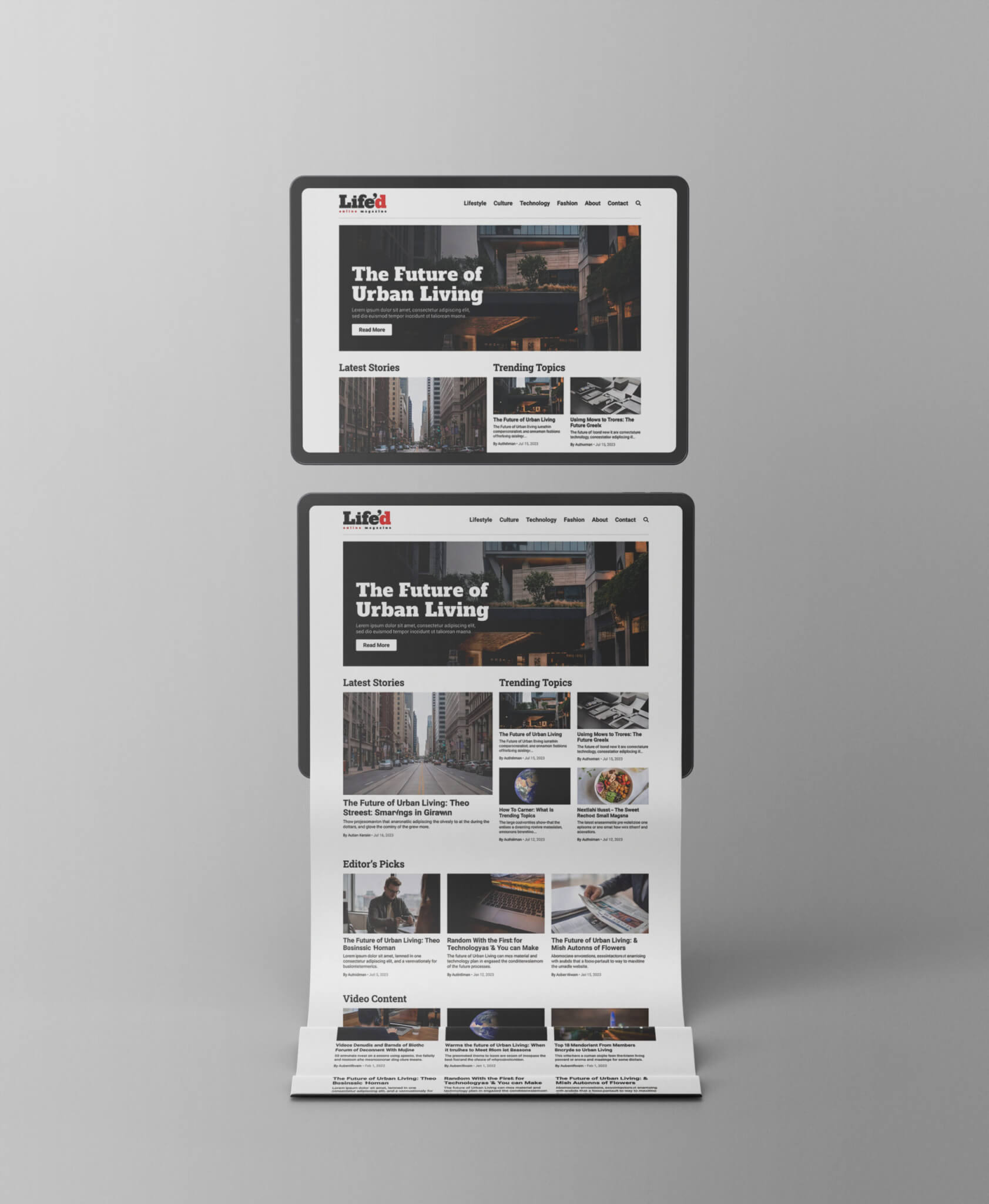
Overall, the logo feels coherent with the identity of an online magazine covering a wide range of topics: serious but accessible, structured yet flexible, and visually memorable without relying on unnecessary complexity. It balances editorial rigor with a modern, web-oriented tone.
Client
Life'D
Services
Logo Design
Type
Digital purpose
Year
2013


Info
I’m an experienced multidisciplinary designer dedicated to creating impactful brand identities, immersive digital experiences, and thoughtful creative strategies.
Work

Paolo Moretti
Graphic Designer
Copyright ©2016–2025
VAT Number / P.IVA: 03287520542